5 Trends Redefining Mobile Learning
How to Design Engaging Mobile Learning Training: 7 Trends Redefining Learning on the Move
Mobile learning is no longer about adapting desktop content to smaller screens it’s about designing experiences that match how people actually work and learn on the move.
Today’s most effective mobile learning strategies combine short, interactive formats with real-world relevance, enabling learners to engage in brief moments between actions.
From micro and nano-learning to interactive video, scenario-based activities, user-generated content, and AI-powered personalisation, these seven trends place action, emotion, and human connection at the center of learning.
By embracing mobile-first design, learning becomes accessible, memorable, and seamlessly embedded into daily workflows — transforming training into a continuous performance support tool rather than a one-off event.
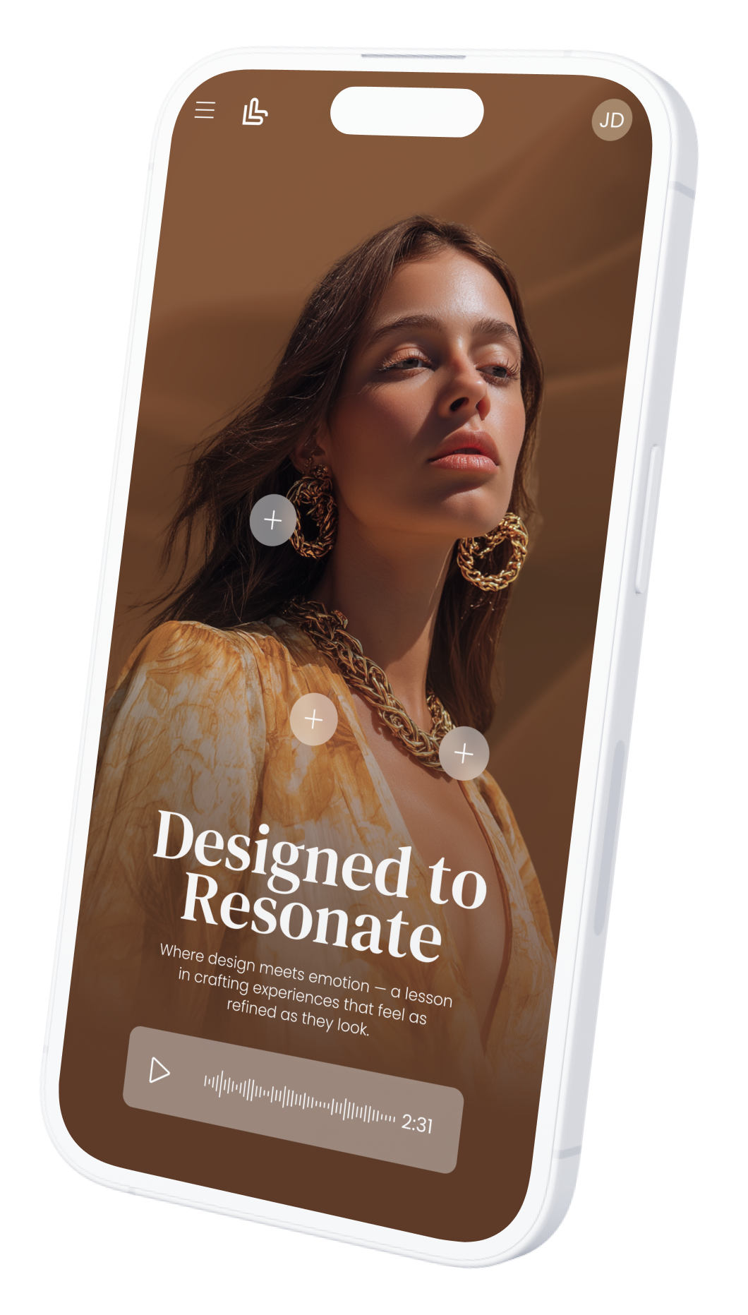
01 Mobile-First, Not Mobile-Adapted: Designing Learning for Real Use
Mobile-first design means creating learning experiences specifically for mobile from the start, rather than shrinking desktop content to fit smaller screens.
Research shows that 70–80% of frontline and retail learners access training primarily on mobile, and mobile-first courses can achieve up to 45% higher completion rates than mobile-adapted ones.
When learning is built around short attention spans, touch interactions, vertical video, and fast access, it aligns with how people actually learn on the move.
Mobile-first design reduces friction, increases engagement, and significantly improves memorisation by fitting learning naturally into daily workflows.
Key Takeaways
70–80% of learners access training mainly on mobile
Mobile-first design increases completion rates by up to 45%
Short, touch-based interactions reduce cognitive load
Vertical video and swipe interactions boost engagement
Designed for on-the-go learning moments, not long sessions
Faster access = higher repeat usage and reinforcement
Ideal for frontline, retail, and automotive teams
02 Micro & Nano-Learning: Learning in the Flow of Work
Micro and nano-learning formats are designed to fit learning into real working moments rather than pulling learners away from them.
By delivering content in short, focused bursts typically 2–5 minutes for micro-learning and under 2 minutes for nano-learning brands align training with natural attention spans and daily routines.
Research shows that micro-learning can improve knowledge retention by 20–30% and increase completion rates by up to 80%, especially on mobile.
When learning is accessible exactly when it’s needed, it becomes a performance support tool, reinforcing skills and knowledge directly in the flow of work.
Key Takeaways
Micro-learning modules last 2–5 minutes; nano-learning under 2 minutes
Improves retention by 20–30% compared to long-form learning
Completion rates can reach 80%+ on mobile
Fits naturally into busy, frontline work environments
Reduces cognitive overload through focused learning moments
Ideal for product knowledge, reminders, and quick skill refreshers
Supports continuous learning without disrupting daily performance
03 Interactive Video & Video Quizzes: Turning Watching into Doing
Interactive video and video quizzes transform passive viewing into active learning by prompting learners to think, decide, and respond in real time.
Research shows that learners retain up to 95% of information delivered via video, and when interaction is added, engagement increases by 2–3× compared to linear video.
Video quizzes activate active recall, which can improve retention by 30–40%, while interactive decision points mirror real situations learners face on the job.
By combining visual storytelling with participation, interactive video makes learning more memorable, impactful, and directly applicable in the flow of work.
Key Takeaways
Video can drive up to 95% retention compared to ~10% for text
Interactive video boosts engagement by 2–3×
Video quizzes improve memory through active recall (+30–40%)
Encourages decision-making rather than passive consumption
Ideal for product knowledge, soft skills, and client interactions
Short, interactive formats perform best on mobile devices
Increases completion rates, often reaching 80–90%
04 User-Generated Content (UGC) & Social Learning: Learning Powered by Peers
User-generated content and social learning shift training from top-down instruction to shared experience.
When learners create and share content videos, challenges, best practices, or real-life examples they move from passive recipients to active contributors.
Research shows that people retain up to 90% of what they teach or create, and social learning can improve engagement by up to 50%.
By enabling peer-to-peer learning, UGC reinforces credibility, relevance, and emotional connection, while building a living knowledge base rooted in real work situations.
Key Takeaways
Learners retain up to 90% of what they actively create or teach
Social learning increases engagement by up to 50%
Encourages peer-to-peer knowledge sharing and collaboration
Builds confidence, ownership, and motivation
Anchors learning in real, on-the-job experiences
Ideal for best practices, styling, clienteling, and soft skills
Creates a scalable, authentic content library over time
05 Mobile-First Authoring Tools: One Design, Optimised for Every Screen
Using a mobile-first authoring tool one that offers a true mobile view and separate CSS (or responsive rules) for mobile, tablet, and desktop dramatically improves both learner experience and production efficiency.
Instead of forcing a “one-size-fits-all” layout, designers can tailor typography, spacing, interactions, and media behavior to each device, reducing friction and boosting engagement.
This matters because mobile-first learning can increase completion rates by up to 45%, while responsive, well-optimized experiences reduce drop-off caused by poor usability. With device-specific styling, teams can publish once, maintain easily, and deliver a consistently premium experience across all screens.
Key Takeaways
Mobile-first design can raise completion rates by up to 45%
Separate CSS per device ensures:
Better readability (font size, line length, spacing)
Touch-friendly interactions (buttons, swipe, tap areas)
Optimized media (vertical video, image scaling, loading)
Reduces learner friction and drop-off on mobile
Speeds up production by avoiding “rebuilds” for different devices
Enables consistent brand experience across mobile, tablet, and desktop
Easier maintenance: update content once, layouts adapt per device
Supports modern formats: interactive video, hotspots, micro-activities, UGC
05 Mobile-First Authoring Checklist
Designing Once, Optimised for Every Screen
Mobile (Primary Experience)
Layout & Navigation
Single-column layout
No horizontal scrolling
Thumb-friendly navigation (bottom or easy reach)
Clear progress indicator
Typography
Minimum 16–18px body text
Short paragraphs (2–3 lines max)
High contrast for readability
Interactions
Buttons ≥ 44px height (touch standard)
Swipe / tap interactions preferred
Avoid hover-only interactions
Media
Vertical or square video formats
Subtitles always enabled
Optimized file size for fast loading
Learning Format
Micro / nano modules (1–5 min max)
One objective per screen
Quick feedback loops (instant validation)
Tablet (Hybrid Experience)
Layout
Two-column layouts when relevant
Larger visuals and richer interactions
Comfortable spacing for touch + reading
Typography
Slightly larger titles
Maintain clear hierarchy (H1, H2, body)
Interactions
Combine tap + light drag interactions
Support scenario-based layouts and hotspots
Media
Landscape-friendly video
Interactive visuals (hotspots, diagrams)
Desktop (Deep-Dive Experience)
Layout
Multi-column layouts possible
Space for dashboards, side panels, or references
Typography
Wider line length but controlled (60–75 characters)
Strong visual hierarchy
Interactions
Click + keyboard support
Hover effects as enhancement (not required)
Media
High-resolution visuals
Embedded video + downloadable resources
Cross-Device Best Practices
Separate CSS / responsive rules per device
Test on real devices, not only previews
Keep interactions consistent, not identical
Prioritize speed and simplicity on mobile
Ensure brand consistency across all views
Track analytics by device to optimize continuously

Conclusion: Designing for Movement Means Designing for Impact
Designing engaging mobile learning is no longer about content adaptation it is about intentional experience design.
The seven trends redefining learning on the move all point to the same shift: learning must be short, interactive, human, and embedded in real work moments.
Mobile-first design, micro and nano-learning, interactive video, social learning, and smart authoring tools transform training into an accessible, continuous performance support system.
When learning fits naturally into daily workflows and invites action rather than attention, it becomes memorable, repeatable, and impactful—driving real behavior change wherever work happens.